Section 1
Hierarchy
As with everything else in motion graphics, when you start placing your elements in your scenes the driving force should be your story. Don’t ask yourself ‘Does it look cool if I place this text here in the corner?’. Instead, ask yourself ‘How important is this text for my story? Does it get the right amount of attention when I place it here in the corner?’. And just like with colors, this question can only be answered if you consider all the elements of your scene. You can only judge if the color of a text is good if you know all the other colors in your scene. And you can only judge if a text attracts the right amount of attention if you know how distracting all the other elements in your scene are when compared to it.
So, when you start placing the elements into your scene, you’ll need to come up with a hierarchy to sort the elements, from most to least important. Here, I’ve annotated our first scene with this hierarchy.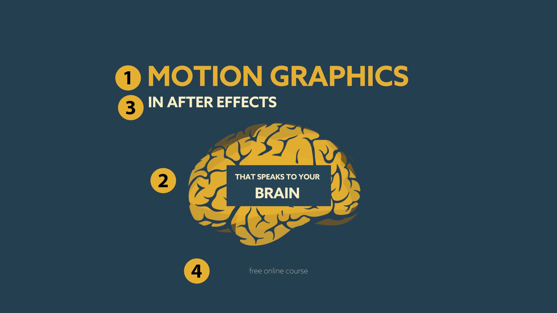 The most important part is our title, MOTION GRAPHICS, which explains what the entire scene is about. The other texts are just details, which are not as important as the main graphical element: the brain shape with the text on it. In the final animation, the animated shapes that transition into the brain shape visualize what motion graphics is about, so they support the message of the title nicely. Hopefully they keep the viewer interested, so that when they look at it, they’re sufficiently focused to also notice the other elements in our scene. The information that this course is about After Effects is more important than the part about it being a free online course, for example, so these elements get places 3 and 4 in our hierarchy, respectively.
Once you’ve decided the hierarchy of your elements, how do you control the importance of the elements in your scene? Here’s a (non-comprehensive) list of the tools you have for this task.
Controlling Your Hierarchy
We talked about color and font-weight, and size should be pretty obvious. So, let’s elaborate a little more on the last two entries on the list.
Location
When you look at something, you turn your head and move the object of interest into the center of your field of view. Try to focus on something at the periphery of your vision while not moving your head. Notice how exhausting this is? If you look at an animation, you naturally also have a bias to focus on things that are in the middle.
But that’s not all. Human beings are masters at adapting to their environment, so even the culture we grow up in influences what we focus on. When you’re reading this book, you parse the information on the page from left to right, and from top to bottom. You’re used to this. When looking at a new page, you intuitively begin by looking at the top left corner of it. If you’ve grown up in a culture with a right to left script (like Arabic or Hebrew), and in particular if you watch a motion design that includes this type of right to left text, it’s very likely that you’ll focus on the top right corner instead. But in general, if you stack things on top of each other, you’re biased to looking at them from top to bottom. Here’s an example.
 In the left variant, the MOTION GRAPHICS text and the brain element below it have almost the same importance, but when looking at it you’ll still start reading more or less immediately. In the variant on the right, you’ll probably look at the brain first, focusing your attention there for a while before you start reading the text.
So what’s the bottom line? If you know something should be more important, move it closer to the center of the view. When you stack things on top of each other, be aware that the viewer will parse them from top to bottom. If you place something near the borders of the comp, it won’t get much attention. However, the top left corner can get your viewers’ attention, particularly if there’s no eye-catching content competing with it in the center.
Motion
For now, we’re just designing static scenes. But I’d already like to mention at this point that in the final animation, you’ll have another secret weapon to highlight what’s important: movement. Move something, and the viewer will look at it immediately. So, you can deliberately give certain elements in your composition very little focus, before bringing some of that focus back later on by using animation. But more on this later, in the Focus chapter.
Balancing All these Factors
So, does your most important element always have to be in the center, be the biggest, have the most contrast, etc? No. 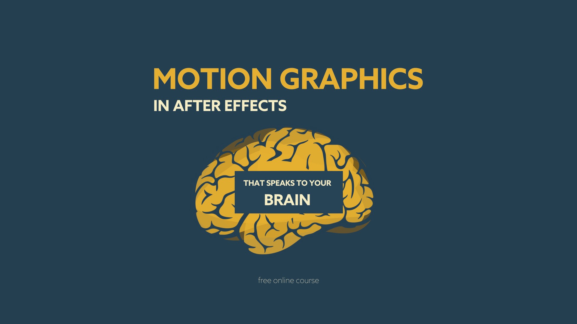 If we take a look at this layout again, you’ll notice that the orange text MOTION GRAPHICS is slightly darker than the two other texts in the scene. However, despite having less contrast, it is still clear that this text is the most important, since it’s far bigger than the other texts. In other words, I first dialed down the importance of the two other texts quite a bit by reducing their size, and then brought a little bit of attention back by increasing their contrast, to ensure they still get noticed to some extent.
So, if an element gets too little attention, you can increase any of the factors that influence it, but you don’t have to increase all of them. If you decide to make an element smaller but want to keep the level of focus it has, you can increase its contrast or place it in a more prominent location to compensate. So, layout is mostly about dialing in all those aspects so that your hierarchy is clear.
How do you know that your hierarchy is clear? Trust your intuition, or test it – look away for a few seconds and then look at your design once again. Notice your own reaction. What elements are you looking at, and in which order? What do you notice first? Are there things you overlook entirely? Sometimes it can be ok for elements to go unnoticed, for example if they are purely design elements that add to the overall look but have no specific meaning. But you need to make sure that the viewer notices each of the key elements in your story.When you look at a scene, all of this happens very fast. In a fraction of a second, you’ll identify the few most prominent elements in your design. The more you practice, the easier it will become for you to observe yourself and understand what you focus on. Also, if you’ve worked on a scene for hours, you know every detail about it and ‘read the content’ much faster than somebody who sees it for the first time. For this reason, it can be really helpful to take a break or work on another scene before testing your hierarchy. Looking at a scene with fresh eyes can make a big difference.

The ExpressionTimeline allows you to apply several expressions to a property, so that each expression is ony active for a certain period of time. Instead of an abrupt change between expressions, you can smoothly transition from one expression to the next. What's more, you can specify time intervals in which no expression is active, so that the keyframed motion is considered.

Buy BeatEdit for After Effects and BeatEdit 2 for Premiere Pro and save $50!
BeatEdit detects the beats in your music and generates markers for them in your Premiere Pro timeline. Create automatic edits in sync with the music, or let BeatEdit assist your manual editing process.