Section 3
Common Measurements
This can be considered yet another instance of the ‘Less is More’ principle, this time applied to the sizes and distances of the elements of your design. Let’s analyze the sizes and distances in this part of our design:

If you look closely, you’ll notice that the first text is exactly twice as tall as the second, and that the distance between the two is exactly the same as the height of the second text.
So, if the main text has a font size of 100px, for example, I’ll choose 50px as the font size for the secondary text and also the distance between the two. Note that when I cropped the image, I also ensured that the margin around the text is exactly 50px. Although the viewer may not notice this consciously, it makes everything feel more uniform and balanced. You don’t always have to go for this 2:1:1 ratio (main text:distance:secondary text). The key point is that you should try to set all sizes and distances to a multiple of one fixed size, in this case 50px.
Note that you can go a little crazy with this. You could choose the font-weight so that the line thickness of your letters is exactly 1/4th or 1/5 of the letters themselves, for example. But I recommend not taking this principle too seriously – there’s no need to be 100% accurate. Even the letters of a font aren’t usually exactly the same size (intentionally); the O is a tiny bit higher than the N, for example.
It's ok to break the rules, and not everything in your design has to be based on common measurements. However, using common measurements will really help to give a more uniform, consistent design. The results will be easier on the eyes, and the easiest way to create these is to place all the elements of your design onto a grid. I find this so useful that I even developed an After Effects extension, GridGuide, for just this.
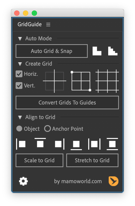
GridGuide allows you to quickly create grids and also align objects to these grids.
Automatic layouts, snappable guide grids and modifiable shape layer guides - because motion design isn't static.
BeatEdit detects the beats in your music and generates markers for them in your Premiere Pro timeline. Create automatic edits in sync with the music, or let BeatEdit assist your manual editing process.

Export text from your After Effects project into a spreadsheet, then apply the modified spreadsheet to the Ae project once again with a single click. Perfect for text translation, client review and other text processing tasks.