Section 2
Less is More
When you start working with color themes, they might seem to impose unnecessary limitations on your creativity. Why should you use just five colors in your entire design?
As with many design questions, the answer is: Less is More. Motion graphics (and design in general) is about communication. When you want to communicate clearly, you need to have a clear focus and avoid any kind of distraction. A uniform use of color adds consistency and structure to your design. And this applies to more than just color – you’ll hear the same from me again when I talk about fonts and layout, for example.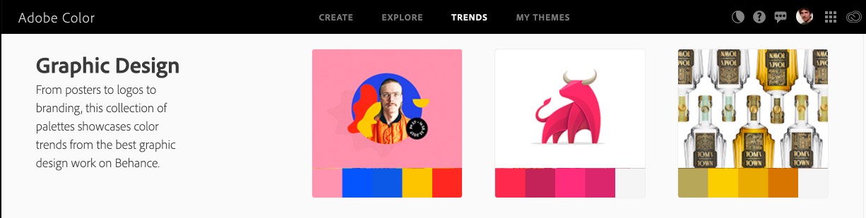 In the image above, you can see a screenshot from the Adobe Color website that shows some of their trending design work, and the color themes that their algorithm has extracted from the images. If you look at the colors of the themes, you’ll notice that some of them are just different shades of more or less the same color. The most obvious case is the image of the bull, which consists of just white and four variations of a red color. In other words, the algorithm that extracted the color themes from the images actually found less than five predominant colors in the image, and so decided to include various shades in the final theme.
If you reuse the same color in different parts of your design, everything will feel more consistent. Force yourself to work with a limited number of well-harmonizing colors, and your designs will look more professional.Take a look at the promo video for our After Effects extension iExpressions, for example.
The entire video uses just three colors: blue for the background, white for the foreground, and orange, which is used only for the iExpressions icon. This icon is the main ‘character’ of the story and the linking element between all the different scenes. Giving this icon its own, exclusive color gives it a clear focus - not because the color is special, but because the colors for everything else are more muted. Less is More.

Create complex expression-driven templates, character rigs, shape animations and more without writing any code!

Export text from your After Effects project into a spreadsheet, then apply the modified spreadsheet to the Ae project once again with a single click. Perfect for text translation, client review and other text processing tasks.

Your next generation file import dialog with super-fast, fuzzy keyword search and a built-in audio player - for Premiere Pro, After Effects and Audition.