Chapter 2
Color
Let’s compare the following two color variants for our course title.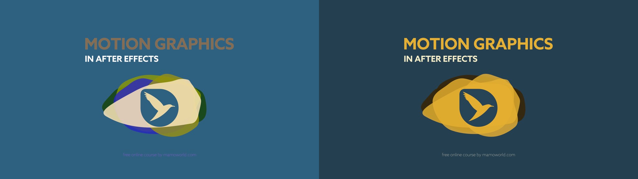 Yes, the second variant looks much better, but what is it exactly that makes it look more appealing and professional?
Many beginners don’t think much about color. They start adding elements to their scene and colorize them in a spontaneous or even random fashion. They assume that the poor results they get are caused by their lack of experience, and that they just need more experience to pick cool colors and get amazing results intuitively. But it’s not just a matter of experience – there are a few rules. Follow these rules, and you’ll instantly be able to make better, more informed color choices.

Split text layers into characters, words, lines and more. The placement of each character is accurately preserved without expressions, text animators or other tricks.

Create a mouth that automatically animates according to your voice recording.
Join our newsletter for updates on this book and more great stuff we create!