Section 1
The Font is not your Story
Like all decisions for your motion design, the choice of the font is also driven by your main goal: to tell a story, to convey a message. This text has a clear message:

It says: ‘Motion Graphics’. These texts also have a message: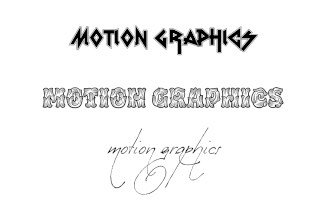
They say: ‘Hey, look at this cool font I found!’. Your font is not your story. You want to communicate something with your motion design and the viewer should focus on your message. If your font has its own message, it will irritate and distract the viewer.
Beginners often feel that their design doesn’t look exciting enough, so they think about what’s missing; they start adding crazy fonts, some drop shadows, a few effects. But instead of asking what’s missing, it’s better idea to ask ‘what’s too much?’. The more your design and animation is focused on your message, the more professional and appealing it will be. Less is More.
Automatic layouts, snappable guide grids and modifiable shape layer guides - because motion design isn't static.

Link texts, colors and data from your Ae project to a JSON file.