Section 2
Less is More
Like with colors, we work with a limited number of fonts that we use throughout our project. If you’re a beginner, use just one font family. Yes, the same font for everything in your project. As you get more experienced, you can start combining two font families, but combining fonts is difficult to get right and you can’t go wrong with using just one font.
With your Creative Cloud subscription, you already have access to a large collection of fonts. So, let’s open Adobe Fonts(https://fonts.adobe.com/fonts) and find a font for you to use.
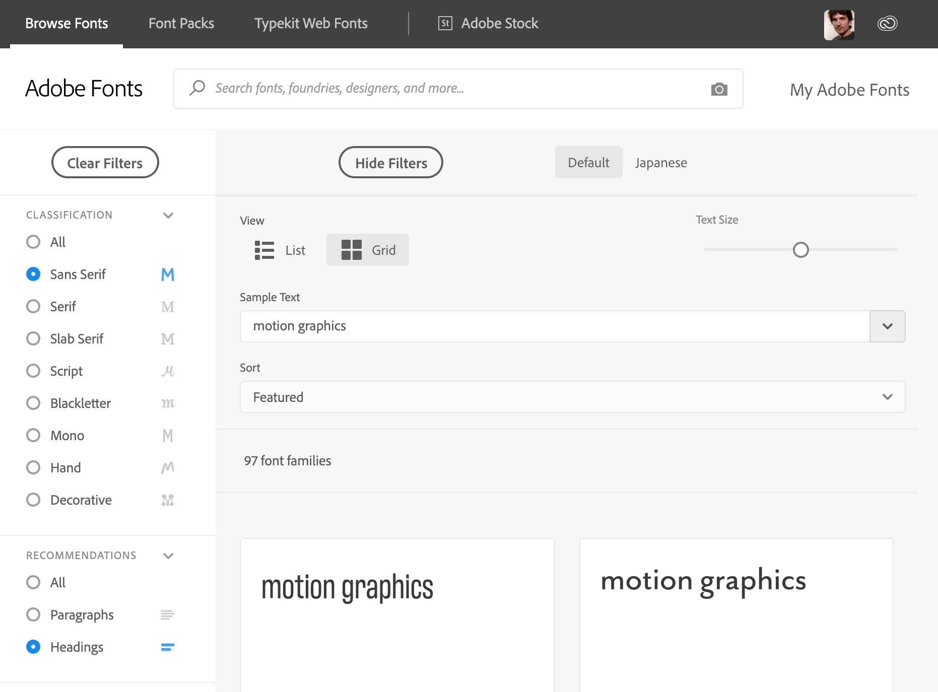
In order to not distract your viewer, your font should be low-key. Clean, simple lines without much decoration. This means in the Classification section on the left of the search window, you want to only search for Sans Serif fonts. Definitely avoid fancy things like the Script or Decorative category. Sometimes you can go for a Serif or Slab Serif font, but usually Sans Serif is the best choice.
Serifs
Serifs are those little extra lines that on the corners of the letters, and fonts with serifs are typically used for books, newspapers and other long paragraph texts. They’re a decoration, but they should also improve the readability of long passages of text, since they help the eye travel across a line. Effectively, the serifs hint at lines at the top and bottom of your letters that separate the current line from those above and below. However, since you never deal with long passages of text in motion graphics and since we want to avoid any clutter, a Sans Serif is usually the better choice.
Headings
Serifs are just one aspect of font design that improves the readability of long text passages. In general, fonts can be designed and optimized in one of two ways: for use in paragraphs, or for use in headings (or other short texts with big letters). To ensure that your font works well, even if your text is just a few words long, in the Recommendations settings of the Adobe Fonts website (bottom left in the screenshot above), choose Headings.
More is Less
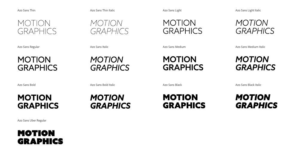
We‘ve learned that in design less is usually more, but here’s an exception: you’ll want to choose a font family with many font variants. Font families usually have a regular, italic and bold variant, but some have much more. Here are the different variants of the Azo Sans family, which is the family we use in our project.
 So why did I first tell you that you should just use a single font family and then insist on it having many family members? The answer is simple: hierarchy. We’ll come back to this later in the layout chapter, but each scene has elements that are more important, and others that are less so. You need to ensure that the viewer first focuses on the important parts. In the color chapter, we learned that we can control the viewer’s focus with contrast – the more contrast you have, the more focus an element receives. With type, this focus can be adjusted by using a different font weight. If you feel that an element in your design has less focus than it needs, you can try to choose different colors to give it more contrast, or you can choose a bolder font. So, font weight and contrast are two different factors that you can tweak to ensure each element gets the right amount of focus in your design.

Buy BeatEdit for After Effects and BeatEdit 2 for Premiere Pro and save $50!

Your next generation file import dialog with super-fast, fuzzy keyword search and a built-in audio player - for Premiere Pro, After Effects and Audition.