Chapter 3
Type
Let’s start this chapter with an example again.
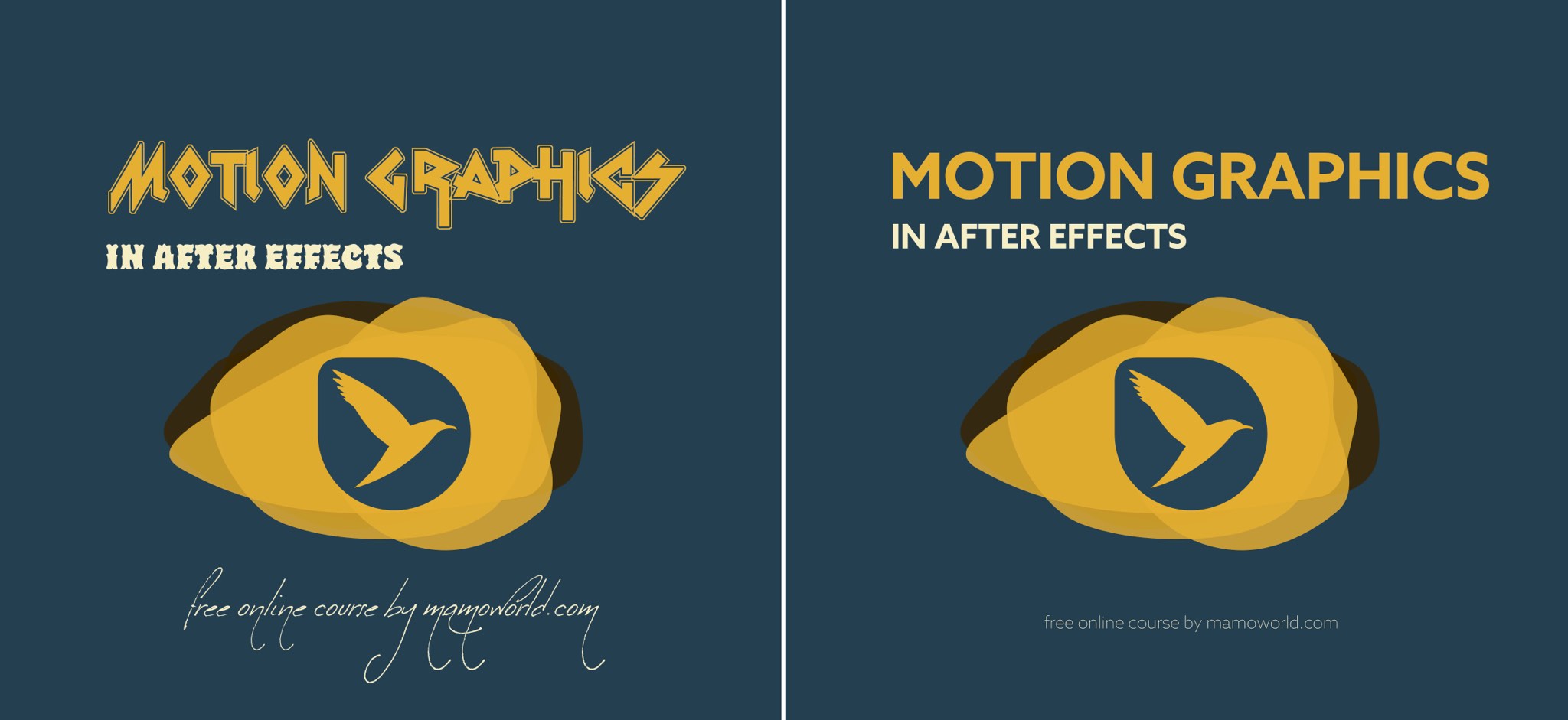 Obviously, the font choice in the left variant is suboptimal. The right variant looks much cleaner, is easier to read, and everything feels more consistent. But how do you choose a good font? Just like when choosing colors, there are some basic rules for choosing fonts. Follow these and your designs will become more professional.
Move layers, make corner pins, stabilize clips and create stabilized precomps with the AE mask tracker.

Buy BeatEdit for After Effects and BeatEdit 2 for Premiere Pro and save $50!

Auto-detect beats in a music track, wiggle to the beat, write markers,repeat keyframes, stagger layers, and more!