Tutorial: UX with Spring Animations in Adobe After Effects
A workflow for Animation in User Experience Design in Adobe After Effects for Android, iOS or Web Apps.
The Workflow
So, you’ve designed the user interface of your app in Adobe Xd, Sketch or Figma and now you want to implement it in Android, iOS or a web app. But before you start coding, there’s one little thing missing in your design: animation. How does the loader spin, exactly? When a message is deleted, does it just disappear abruptly, fade out, scale out, or perhaps fly into a trash can icon? And what’s the exact timing for that move?
You’ll need to answer these questions before the app is actually implemented. But here’s the problem: you can’t just ask a motion designer to create some videos with the behavior you want, because a developer won’t be able to implement these animations based only on a sample video. The programmer will need the exact motion path and timing details to recreate the same animation in your app. And to make matters worse, those details are very different for Android, iOS and web apps.
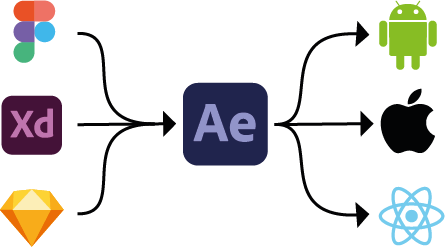
In this article, I propose a workflow to first import your designs from Xd, Figma or Sketch into Adobe After Effects (Ae), then create animations there using the spring tools in iExpressions. When it comes to interactivity, spring animations have some big advantages over traditional keyframes, which we’ll discuss in more detail later. But more importantly, it’s not only easy to create spring animations in After Effects, they can also be easily implemented in Google’s Android, Apple’s UIKit (or SwiftUI), and Facebook’s React. One major potential hassle is that the parameters for spring animations are different for each platform - Google, Apple and Facebook all cook their soup a little differently. Fortunately, the After Effects extension iExpressions comes to the rescue. It allows you to not only easily create a spring animation in After Effects, it also calculates all the parameters you need to recreate the exact same behavior with Android Spring Physics, UIKit’s UISpringTimingParameters, or SwiftUI’s interpolatingSpring and react-spring. So even though all these spring animation systems are very different, once you’ve designed the animation in After Effects, you’ll have an easy recipe to precisely implement the same animation across all major platforms. In this way, your app will have a consistent look and feel throughout all these platforms.
From Static Designs to Animation
With Adobe XD, Sketch or Figma, there are plenty of solutions for designing user interfaces for mobile apps, web apps etc. Naturally, these tools focus on static designs. You draw an artboard for each screen of your app - say the login screen, the main chat screen and the address book of your new messaging app. Next, you connect those static designs with actions to create mockups. You could specify, for example, that the mockup should start by showing the login screen and when the login button is pressed, it should transition to the main chat screen. This way you effectively create interactive slideshows that give the user a pretty good idea of how to navigate the app.

These mockups are very useful for communicating how an app is supposed to work long before it’s been implemented, but in terms of animation, they are very limited: you only have a handful of presets to transition from one screen to the next. So if you want to visualize exactly how a loader symbol spins after the login button is clicked, or how fast (and with what kind of easing) a document flies to the trash icon, you’ll need some dedicated animation software. Adobe After Effects (Ae) is the de facto standard for motion design, so it’s no surprise that Xd (which is also developed by Adobe) can export a design to Ae with a single click. If you’re using Figma or Sketch, there’s also a free tool (AEUX) to bring designs from these applications into After Effects in no time.
Keyframes - so obvious, but such a bad idea
As with almost any other animation software, After Effects is based on keyframes. To move an object from A to B, you specify what time it starts at A (the first keyframe) and what time is gets to B (the second keyframe). In addition to these times, each keyframe has easing information attached to it that describes the timing of the move, for example whether it travels at a constant speed, or starts slow and accelerates over time. In After Effects, the easing is described by terms like linear keyframes, easy ease keyframes and a speed graph – for a comprehensive explanation of these, see the Keyframing in After Effects Chapter of our free eBook Motion Graphics in After Effects that Speaks to Your Brain. In the web development world, easing is expressed differently, in the form of CSS easing functions.

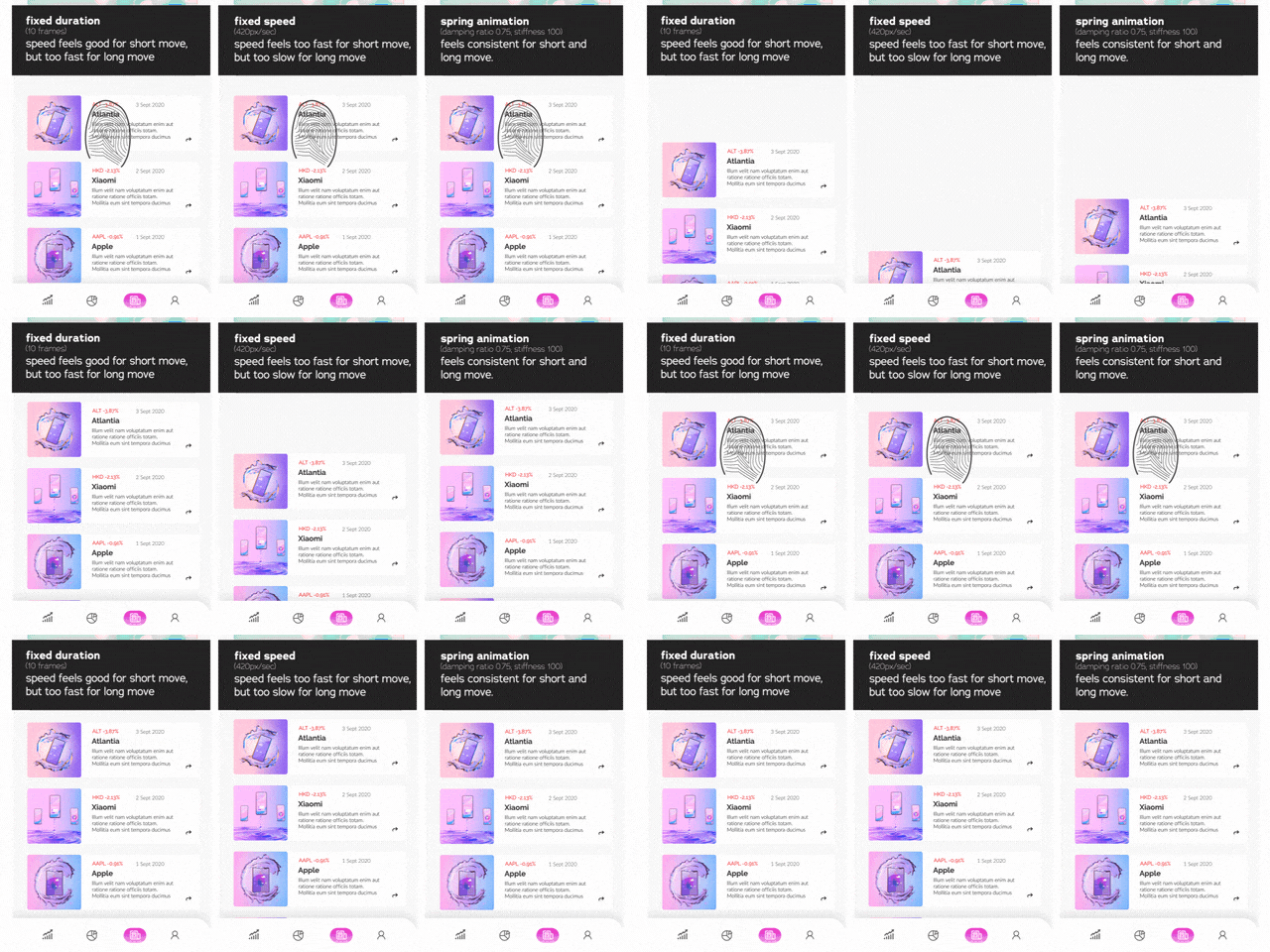
While keyframes are great for most animation jobs, for user interface design they have some serious drawbacks. A key difference between an animation for a video clip and one for an interactive interface is that the latter changes depending on the user’s input. Take a look at this simple animation, which moves the content back in place after the user has dragged it downwards. Depending on how far the user drags it down, the move back up is longer or shorter. Of course, all these variants can be easily keyframed; however, the app developer doesn’t need three or ten examples, he needs one recipe for how to move the content back, no matter how far it was dragged.
Since keyframes have a fixed time, the move between two keyframes consists of a fixed duration and some easing details. Keyframed moves can be explained to an app developer with words like “Move back in place in 0.3s with a constant speed” or “Move back in place in 0.5s and ease in at the end of the move”. But while it might seem obvious that a motion is described by a duration, this doesn’t work well for interactive animations. For our example, if both have the exact same timing it means that short moves (where the user drags down just a little) appear too slow, while long moves (where the user drags a lot) appear too fast. Essentially, the movements don’t feel natural. We want the move to feel the same, no matter how far the element was dragged. This means that shorter moves need to be finished in less time than longer ones.
So, if it’s not the duration, what else is it that we want to be consistent across all variants of the move? It’s not the absolute speed – it doesn’t help to say “move back in place with a speed of 100px per second” instead of “move back in place in 0.5 seconds”. If the user drags down 100px we don’t want this move to last ten times as long as a little 10px move, as this would be way too long. Longer moves need more time than short moves, but they should still be quite a bit faster. The natural solution seems to be a middle ground between the two extremes of fixed duration and fixed speed.
Spring Physics - better and even easier!
If you want animations to feel natural, think about how things move in the real world – after all, that’s what users are used to and perceive as natural. In the real world, things don’t move with keyframes and easing curves - they move based on physics. Forces push and pull objects around, friction or damping makes them slow down, etc. But you don’t need a full-blown physics simulation like in a computer game to create a natural user interface; in fact, you can achieve this with a very simple concept. Welcome to the world of spring animations.
Like keyframes, spring animations are a general concept to move things from point A to point B, but they are a very different approach to animation. To move an object from position A to position B, you just specify that it is attracted by B, as if the object were connected to point B with an invisible spring. You specify the physics parameters that describe exactly how the spring pulls, and then the object moves to B. So if A and B are very close, the duration, speed etc. of the move is very different than if A and B were far apart. What you specify with the spring parameters is not just how fast and how far it moves, but rather how the move should feel. Is it a heavy object, or does it slide easily? Does it overshoot? These aspects can be controlled with the spring parameters.
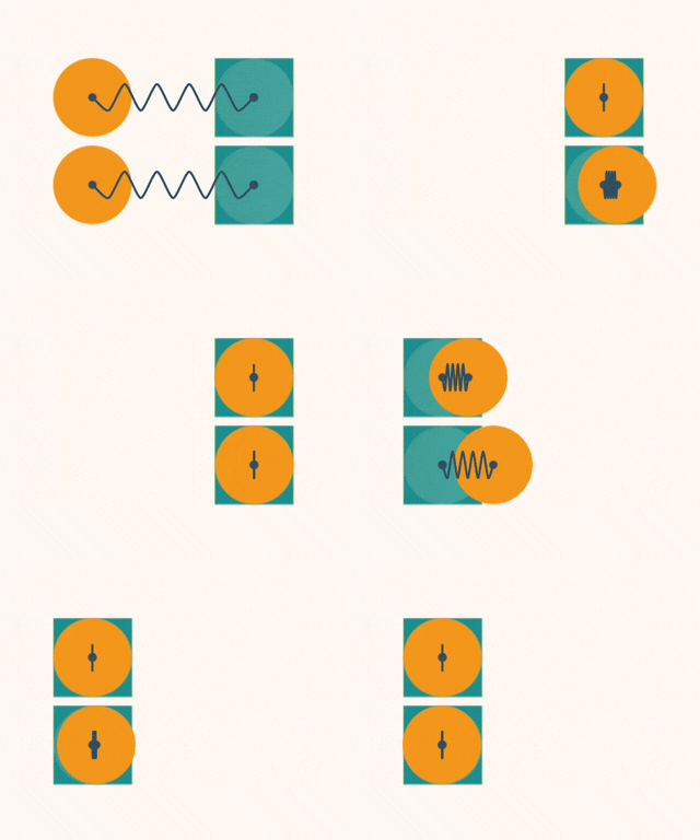
There are different ways to describe a spring (more on that in the section about implementation), but for now let’s see how Android describes springs: with stiffness and damping ratio, just two parameters! Instead of dealing with a ton of different keyframe types, easings and durations, you describe each move with just two numbers! Android has four default values for both damping and stiffness, and the following chart demonstrates what all combinations of these values look like.
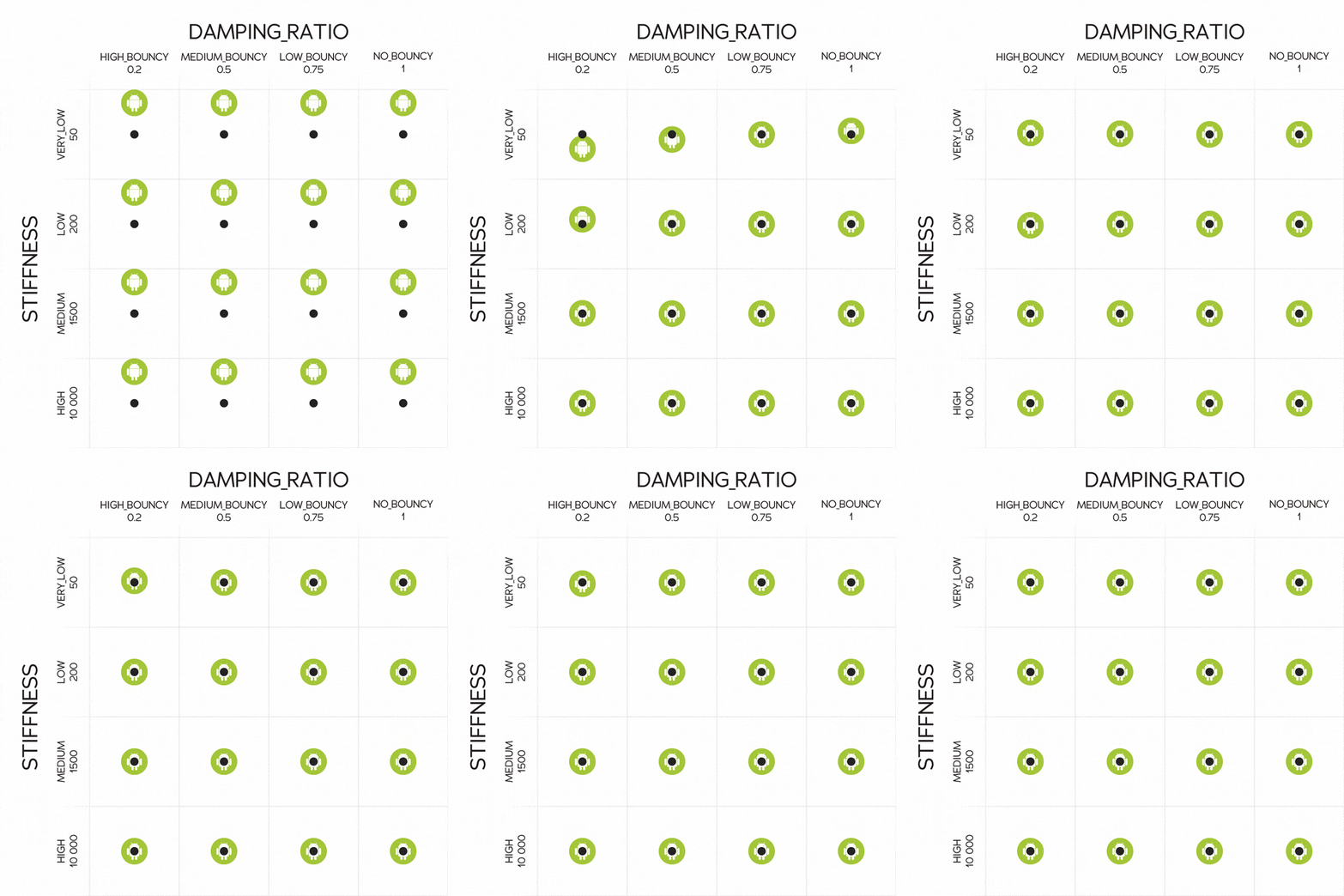
As you can see, the animations in the first row move slowly, while those in the last row move very fast. So, the stiffness essentially corresponds to the speed of the animation – the stiffer the spring, the faster it pulls an object to its target position. The damping ratio controls how much the move overshoots and/or swings. You can see that in the first column (DAMPING_RATIO_HIGH_BOUNCY) the move swings a lot, whereas in the rightmost column (DAMPING_RATIO_NO_BOUNCY) there is no overshoot at all. Of course, when designing spring animations, you aren’t limited to the four constants shown here – you can adjust the stiffness and damping ratio however you choose.
If we think about the drawbacks of keyframes that we discussed above, spring animations solve them easily. A spring “feels” the same, no matter how far it’s stretched. For long moves, the spring is stretched a lot and so pulls more strongly than for short moves. With the same spring parameters, long moves are faster that short ones (exactly how we want them to be), but still feel very consistent.
It’s also worth noting that springs don’t need to be springy! For most motions, you won’t want overshoot (i.e. you’ll want to choose DAMPING_RATIO_NO_BOUNCY). Using spring animations isn’t about being springy, it’s about creating smooth animations that feel natural and fluid.
Design: Spring Animations in After Effects
Spring animations aren’t natively supported by After Effects, but as we mentioned above, they’re very easy to create with the extension iExpressions.
First, keyframe your moves as usual, without worrying about the easing. You then apply the Android Spring iExpression to the keyframed properties to add spring-based easing. The Android Spring expression has exactly the same spring parameters as Android, so you can be sure the animation will behave exactly the same. If you’re used to using Apple’s spring parameters, you can use the UIKit Spring iExpression instead. Note that you can choose the Android or UIKit expression based on personal preference – it’s no problem to design an animation with the Android Spring iExpression then later implement the animation in UIKit, or vice versa. If you’ve never worked with spring animations before, I highly recommend using the Android expression, since Android has one less parameter to worry about, comes with intuitive default values, and is just as powerful as Apple’s variant.
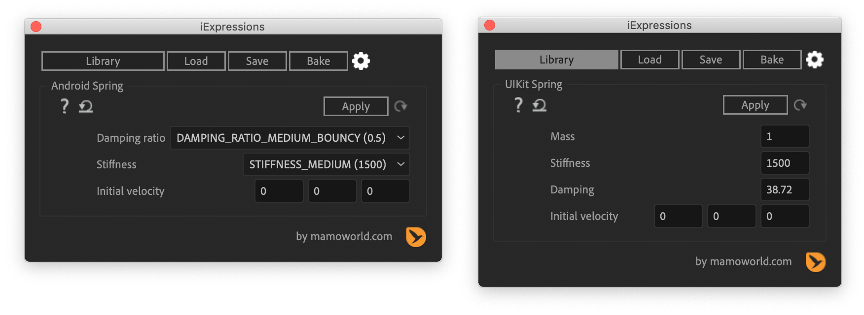
When you’re done with your design, how do you tell your Apple, Android or React developers how to actually implement the animations? It couldn’t be easier: just load the spring expression you used into iExpressions and apply it to the source text of a text layer. When applied to a source text, the expression converts the spring parameters into the corresponding parameters for all the different spring implementations (Android, UIKit/SwiftUI and react-spring), and outputs these onto the text layer. This makes it super easy to bake all the information your developers need right into the videos that you export from After Effects.
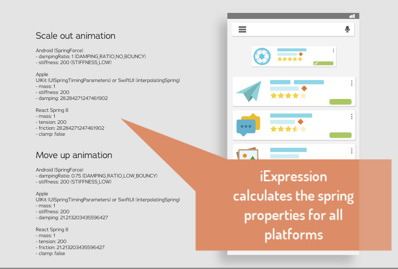
Here’s a little tutorial to demonstrate this process:
So far we’ve only talked about movement, but spring animations can also be used for any kind of animations, like scaling or rotating objects. To imagine what a spring animation on the scale property looks like, for example, think of the scale property as a slider, with the spring pulling the slider handle from one value to another.

Implementation: Springs in iOS, Android and React
Here are some links to get you started on implementing spring animations
- Apple with SwiftUI : here’s an example, and here’s the documentation for SwiftUI
- Apple with UIKit: you’ll need to create a UIViewPropertyAnimator and provide it with a UISpringTimingParameters object.
- Android: use the SpringAnimation class and specify the parameters of the spring with the SpringForce class. Here’s an example.
- React: take a look at the react-spring documentation for details.
As we mentioned before, the parameters for describing a spring are very different for Android, SwiftUI or UIKit and React:
- Android’s SpringForce is described by stiffness and damping ratio.
- Apple’s SwiftUI, UIKit describe springs by mass, stiffness and damping
- react-spring describes springs by mass, tension, friction and a clamp option
This is not just like one car describing the speed with kilometers per hour and another with miles per hour. Instead, it’s one car working with kph and the other with the traveling time, wheel diameter and the number of wheel rotations – it’s a very different way of looking at things, and going from one to the other is cumbersome. For example, if you’ve designed your animation for Android and now want to implement the exact same behavior in iOS, you’ll need to somehow convert Android’s stiffness and damping Ratio into Apple’s corresponding mass, stiffness and damping.
But as we mentioned in the previous chapter, our After Effects extension iExpressions has an easy solution for this: when you use the Android Spring iExpression (or the UIKit Spring iExpression), it calculates all the different parameters for these systems for you. So, whether you’re designing in the Google or Apple world, you’ll get the parameters you need for all other worlds, too.
Summary
Spring animations make a whole lot of sense for user interface design, but the spring systems available for Android, Apple or the web are so different that it’s hard to create consistent animations for all those platforms. But with iExpressions, not only can you design spring animations directly in Adobe After Effects, you can also easily implement them across all platforms so they always feel the same, whether your user is in a web app, or using an Android or Apple phone.
Download iExpressions for Ae